Project Breakdown: E3 Redesign
A logo designed in the late 90s. A brand identity that resonates strongly with where the industry was in 2009. One woman to do the job of dragging a brand into the current decade.
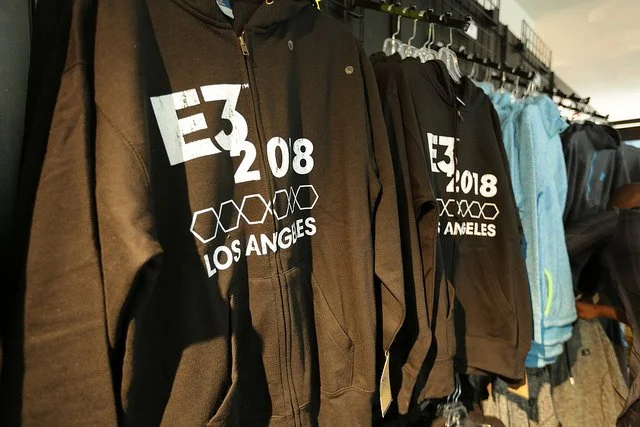
For the rebrand of E3, I was fortunate enough to be working off of the sage guidance of senior executives both within the organization and the feedback from the trusted ESA board. With their direction, I was able to create something modern, poppy, and bright, to communicate an industry that’s looking forward and developing a brighter future.
The logo’s redesign was focused on maximizing the digital use cases and making something that was easy for partners to integrate. To that end, a focus on simple shapes that read well at small sizes was key. Creating a logo that would stand tall on the side of a convention center or as an emoji on Twitter was a unique challenge, but one that allowed me to grow and learn as both a producer and a designer.
Fun fact: this logo was featured in 2021’s Space Jam: A New Legacy. This is my default fun fact, because I’m truly tickled by it.
It’s really in Space Jam: A New Legacy! No registration mark though….


